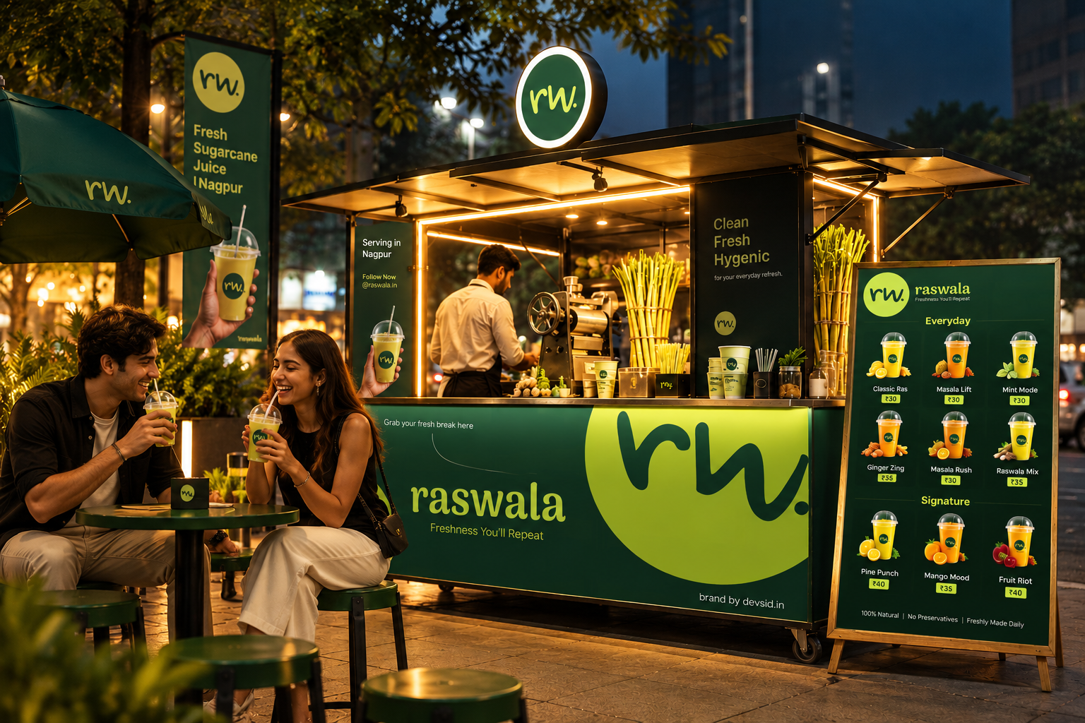
Recognition from a distance
The brand needed a clear, bold presence that could catch attention in a busy everyday setting and remain easy to recognise.

RASWALA / SUGARCANE JUICE
Building a recognisable juice brand across the places customers meet it first — from its visual identity and packaging to the physical outlet experience.
ExploreTurn a familiar refreshment
into a memorable brand.
Raswala needed more than a name on a sign. The brand had to work across the full customer experience — how people notice the outlet, recognise the product, hold the packaging and remember the brand.
We approached the project as a connected design system, bringing branding, packaging and outlet design together so the physical space and takeaway product could feel like parts of the same brand.
Make freshness visible
before the first sip.
The brand needed a clear, bold presence that could catch attention in a busy everyday setting and remain easy to recognise.
The packaging was an opportunity to carry the identity into customers’ hands, making each serving another visible brand touchpoint.
The outlet needed to support the identity in the real world, connecting signage, counter presence and packaging into one coherent impression.
Instead of designing the logo, packaging and outlet in isolation, the aim was to make them reinforce each other — so recognition could travel from the storefront to the takeaway cup.
FROM FIRST GLANCE TO TAKEAWAY
We developed the visual identity as the anchor for the wider experience — a recognisable foundation to carry through customer-facing brand applications.
Packaging extended the brand beyond the outlet. The design direction treats the serving container as a practical product touchpoint as well as a visible expression of Raswala.
The physical outlet was designed as part of the identity system, with a focus on connecting the customer-facing space to the brand’s visual presence and product experience.
Branding, packaging and outlet design were considered together so customers encounter a consistent visual story whether they are approaching the outlet or carrying their order away.
From the sign above the counter
to the cup in your hand.
Packaging as a practical and recognisable part of the customer experience.
PHYSICAL SPACE / SIGNAGE / CUSTOMER EXPERIENCE
One identity.
Three real-world expressions.
Brand identity / visual language
Packaging / outlet / customer touchpoints
The identity provides the common thread. Packaging carries it into the takeaway moment, while the outlet makes it visible in the physical environment. The design system is strongest when these elements are experienced together.
A joined-up brand experience
for an everyday refreshment.
Brand identity, packaging and outlet design shaped as one coherent experience.
A defined visual foundation for customer-facing communication.
The identity carried into the takeaway product.
A physical environment considered alongside the brand system.
This case study focuses on the design work delivered across branding, packaging and outlet design. No sales uplift, footfall or customer-performance figures are claimed without verified data.
A strong food-and-beverage brand isn’t just seen on a sign. It travels with the product and lives in the space.
Make the everyday
recognisable.
For Raswala, the work extended beyond a visual identity. Branding, packaging design and outlet design were brought together to shape how the brand appears, how the product is presented and how the physical experience feels.
Back to selected work↗BUILT WITH INTENT. MEASURED WITH PURPOSE.
A joined-up identity across outlet, packaging and customer-facing moments—built to be recognised in the real world.
Directional targets for a future in-store measurement plan. These are not verified footfall, repeat-purchase or sales figures.
Connect the design system to real-world measurement: establish the baseline, instrument the journey, review performance monthly and optimise against the target.
Build something measurable ↗Whether you're launching something new, levelling up an existing business or entering a new market — let's build something people remember.
Start a conversation